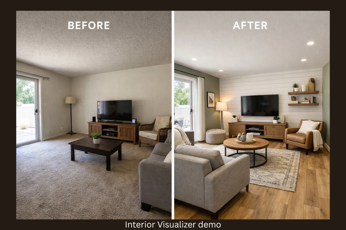
Top 5 Key Findings in Interior Design Trends Reports for 2026 (and Why You’ll Want a Paint Color Visualizer)
Every year, trend reports do the same thing: they make you want change… and then leave you with one scary question:
“What if I pick the wrong color or flooring and hate it in real life?”
2026 trends are especially bold because they’re not just about “what looks good.” They’re about how a room feels cozy, grounded, personal, calming, and real. And the smartest way to use these trends is simple
Use a paint color visualizer (and a room visualizer) before you commit.
Here are the top 5 key findings popping up across major 2026 trend reports and how to apply each one in a practical, non-regret way.
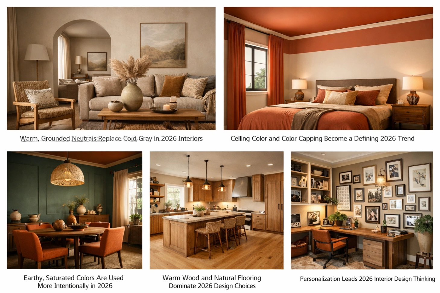
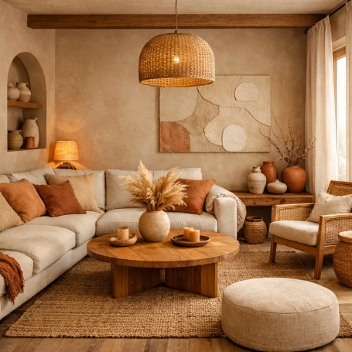
1) Warm, Grounded Neutrals Replace Cold Gray in 2026 Interiors
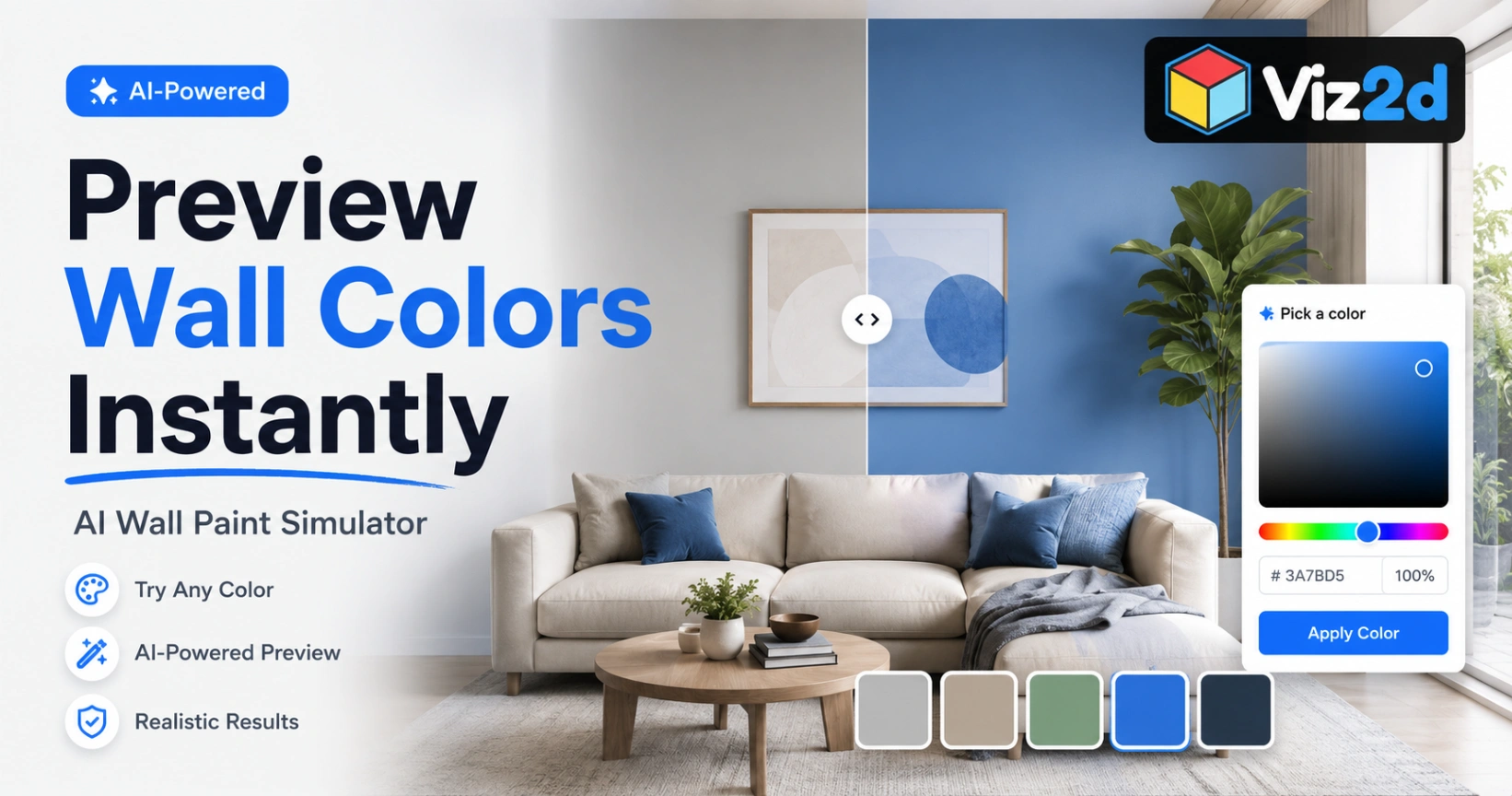
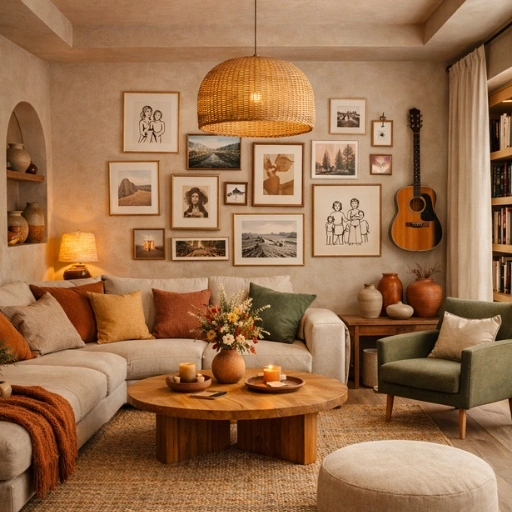
Across 2026 color reporting, the signal is loud: warmer, earthier neutrals are taking over. Think khaki-beige, soft greige, sand, clay, and grounded browns colors that make a space feel lived-in, not showroom-perfect. A paint color visualizer is becoming essential for homeowners and designers who want to apply these trends confidently, preview colors realistically, and avoid costly repainting mistakes before committing.
What this means for you
If your home has cool lighting or low sunlight, warm neutrals can instantly make it feel more welcoming but only if the undertone matches your floors and furniture.
Use a paint color visualizer like this:
Upload your room photo
Test 3 warm neutrals side-by-side
Check undertones against your flooring (yellow-ish, red-ish, or neutral)
Using a paint color visualizer makes it much easier to test warm neutral wall colors for 2026 in your own lighting conditions.
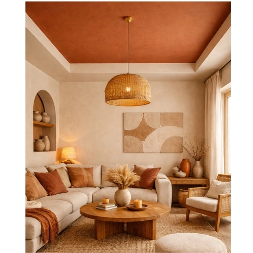
2) Ceiling Color Trends for 2026 and How a Paint Color Visualizer Helps
A standout 2026 finding: the ceiling is becoming part of the color story especially with techniques like color capping (painting ceiling + upper wall areas to create depth).
What this means for you
Even a neutral or “safe” wall color can feel elevated when the ceiling and upper zones are planned thoughtfully. However, the wrong shade or intensity can also make a room feel shorter or more enclosed, which is why testing before painting matters.
How a paint color visualizer helps with this trend
A paint color visualizer allows you to preview ceiling-focused designs before committing. You can experiment by pairing your wall color with a slightly deeper ceiling shade, compare a fully painted ceiling against a partial color cap, and see how each option affects perceived height and overall mood. This makes it far easier to apply ceiling color trends confidently without risking an expensive mistake.
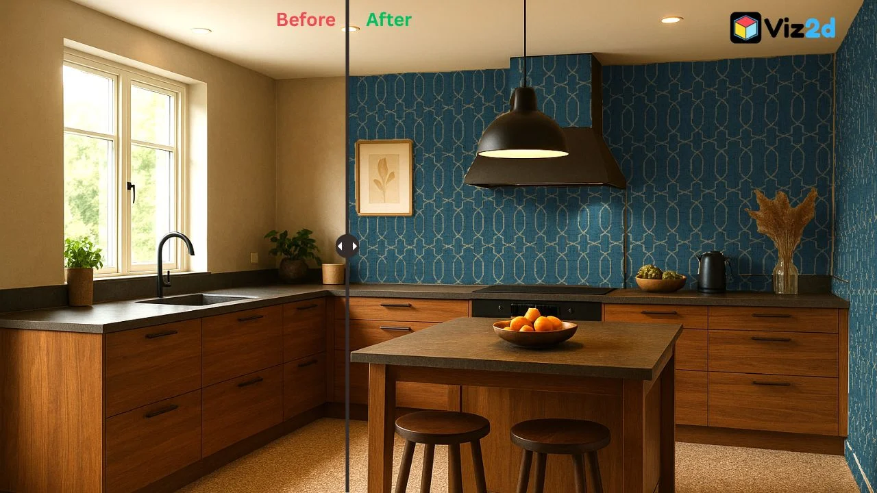
3) Earthy, Saturated Colors Are Used More Intentionally in 2026
This year isn’t only neutrals. Trend write-ups point to saturated, nature-driven tones terracotta, moss/olive greens, deep ochres, moody blues, and deep plums used in a more curated way.
Instead of painting every wall in a bold color, designers are focusing on:
One strong statement wall
Painted niches or shelving
Hallways used as visual transitions
Subtle color blocking through trims and architectural details
How to apply this trend without regret
This is where a room visualizer becomes especially useful. You can test bold colors as accents first, preview them alongside your existing or planned furniture, and make sure they work with your flooring rather than overpowering it. Seeing the full room composition before painting helps you embrace richer colors with confidence instead of second-guessing later.
4) Paint Color Visualizer Insights for Warm Wood and Natural Flooring Trends
Multiple 2026 flooring trend sources show a shift toward warm, natural, earthy tones. Mid-browns, warm beiges, and organic wood finishes are becoming the preferred foundation for modern interiors. At the same time, interest in slightly richer and darker floor tones is growing, especially in living spaces and bedrooms.
What this means for you
Because flooring covers the largest surface area in a room, it heavily influences how every wall color looks. A paint shade that feels perfect today may look completely different once the floor changes, which is why planning both together is essential.
Smarter flooring decisions start with visualization
Before committing to new floors, use tools that let you visualize flooring in your room alongside different wall colors. Comparing warm floors with warm walls versus warm floors with cooler wall tones makes clashes immediately obvious. This approach saves time, avoids costly redesigns, and ensures your paint and flooring choices work together as a cohesive design.
5) Personalization Leads 2026 Interior Design Thinking
One message appears consistently across 2026 interior trend reports, Personalization matters more than perfection. Homes are shifting away from copied showroom looks and toward spaces that feel layered, comfortable, and genuinely lived in. Texture, personal routines, and emotional comfort now guide design decisions more than strict trend rules.
What this means for you
The “right” paint color isn’t the one trending online. It’s the one that works with your lighting conditions, your daily routines, your floors, and the furniture and textures already in your space.
Why visualization gives you an advantage
A paint color visualizer helps you choose based on reality, not popularity. Instead of guessing how a color might look, you can see it working in your own room before making a decision. This kind of confidence-driven design is exactly what modern room visualization tools are built for fewer mistakes, faster decisions, and spaces that actually feel like home.
Conclusion
2026 trends are exciting because they’re not about copying a Pinterest room—they’re about building spaces that feel grounded, warm, and personal. But the smartest way to use these trends is to preview first with a paint color visualizer, a room visualizer, and tools that let you visualize flooring in your room so your “new look” feels right on day one, not after a costly redo.